Android eco-system is growing. Very fast.
Design patterns that were fresh and clean are now old and really user-unfriendly. And trends, like dashboard, are not anymore suggested and recommended.
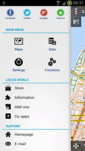
That’s why we decided to implement new and nice solution for Locus main menu.
We expect, that it will brings fast and more comfortable orientation in Locus application. Main advantage is (except fact that it looks really cool) allowed to display a more information at once compared to previous dashboard solution.
Side-effect (positive, don’t worry) of the solution is also reduced number of screens, you have to go through after install or update of Locus. From a four (five for Free version) screens, we reduced it to just once screen!
Big thanks for this, belong also to Jeremy Feinstein for his easy to use/nice looking solution of sliding menu. Thank you!
designimprovementmenu


4 Comments
Hi, Menion,
I'm looking forward to the new main menu - when an how will we be able to use it?
Cheers!
Wilfried
Hello Wilfried,
expected release will be probably at start of next week. I'm just finishing support for Bluetooth HRM monitors and also want to release well tested version.
Hi menion,
since last update with new main menu, direct import of caches with e-mail link doesn't go. Up to now it was easy to import caches this way. It was a very good possibility to update the waypointDB.
Is there a chance to correct this?
Regards,
Karl-Heinz
Wow,
very fast response. That's why I love Locus!!
New main menu is clearer and more stylish than the old one. Imho the way you are going is a good way.
Regards,
Karl-Heinz